Client: Darke Equine
Project: Brand Design
Giving the luxury edge back to horse training
In 2022, we were commissioned to create brand toolkit for ‘Darke Equine’, a new equine business venture started by Army Officer, Rebecca, and specialising in horse riding tuition.

As the creative agency behind creating its branding, our goal was to capture the essence of elegance, craftsmanship, and timeless beauty that Darke Equine represents.
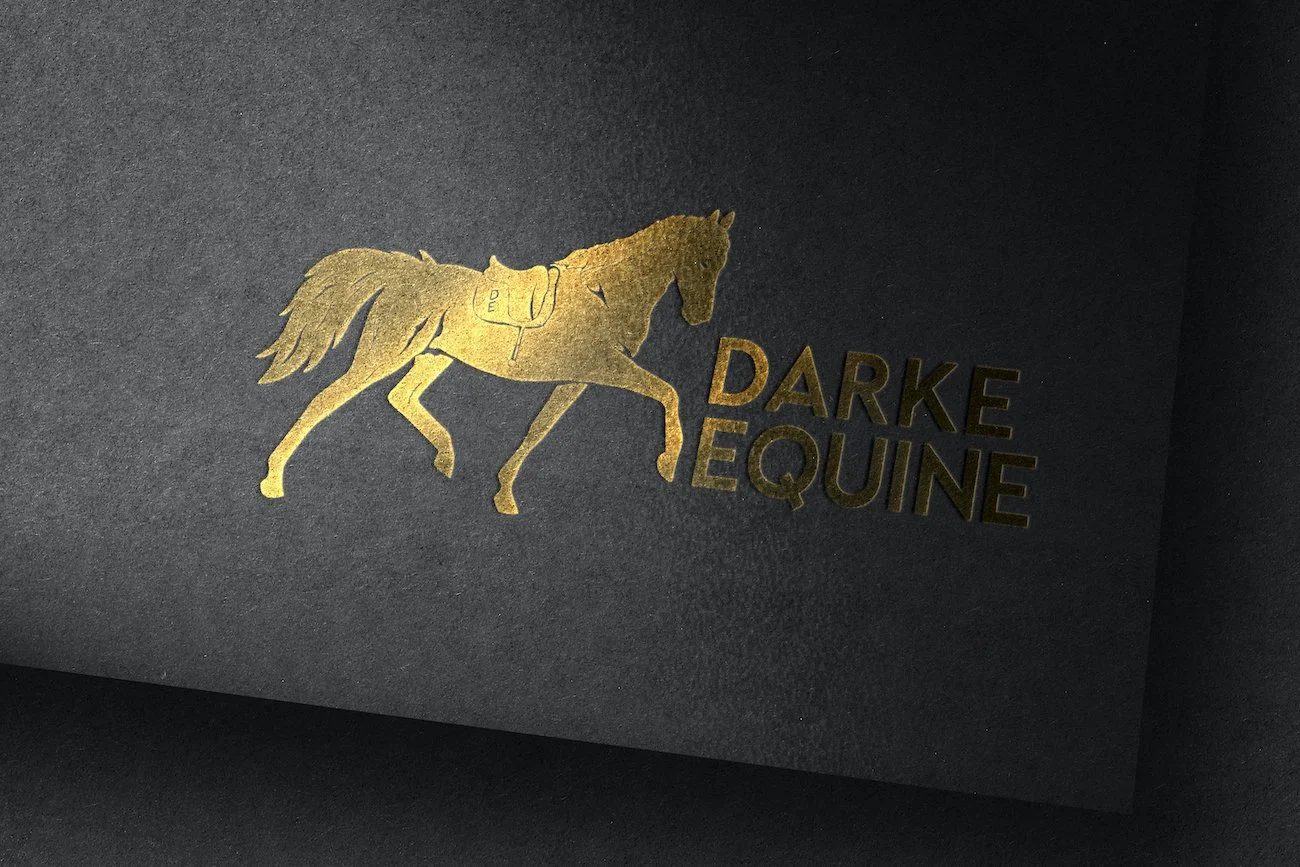
A nice, clear and easy-to-follow brief gave our team the latitude to research, and then creative space to explore a number of concepts – which produced the final image you can see here. The horse was crafted to be used as a standalone logomark on apparel and in place where a nice and subtle reference to the company is needed.
We started by designing a logo that would become the visual anchor for the brand. The logo features a stylised horse with flowing lines, evoking a sense of grace and power. We chose a dark, rich colour palette consisting of deep purples, royal blues, and elegant greys to convey the sense of sophistication and luxury.
For the typography, we selected a combination of classic and contemporary fonts to strike the right balance between tradition and modernity. The primary typeface, a sleek and refined serif font, exudes a sense of elegance and professionalism. It is complemented by a sans-serif font that adds a touch of contemporary flair, reflecting Darke Equine's commitment to craftsmanship while embracing innovation.
The colour palette we chose reflects the timeless beauty and premium quality of Darke Equine's products. Deep purples and blues represent nobility, elegance, and trustworthiness. Subtle shades of grey add sophistication and lend a sense of prestige to the brand. The combination of these colours conveys a sense of exclusivity and refinement that resonates with the target audience.
To enhance the visual identity, we incorporated delicate and intricate line illustrations of various equestrian elements, such as bridles, horseshoes, and saddle details. These illustrations were strategically placed across different brand touchpoints, including packaging, website, and promotional materials, to reinforce the brand's connection with its craft and expertise.
Overall, the Darke Equine branding captures the essence of the company's commitment to excellence, timeless beauty, and luxury. The elegant logo, sophisticated typography, rich colour palette, and carefully curated visual elements create a cohesive and visually striking brand identity that appeals to the discerning equestrian community. Darke Equine's branding now reflects the quality and craftsmanship that sets them apart in the industry, establishing them as a premier choice for those seeking the finest equestrian products.